The Challenge
Retirement planning is one of those things everyone knows they should do but few actually enjoy doing. Most people either avoid it entirely or rely on spreadsheets they never update. The core problem wasn't a lack of tools — it was that existing tools made retirement planning feel intimidating, abstract, and unrewarding. TrailHead needed to turn a long-term, low-engagement financial task into something users could understand at a glance and actually want to come back to.
Creating a retirement planning experience that felt approachable and motivating rather than intimidating and clinical.
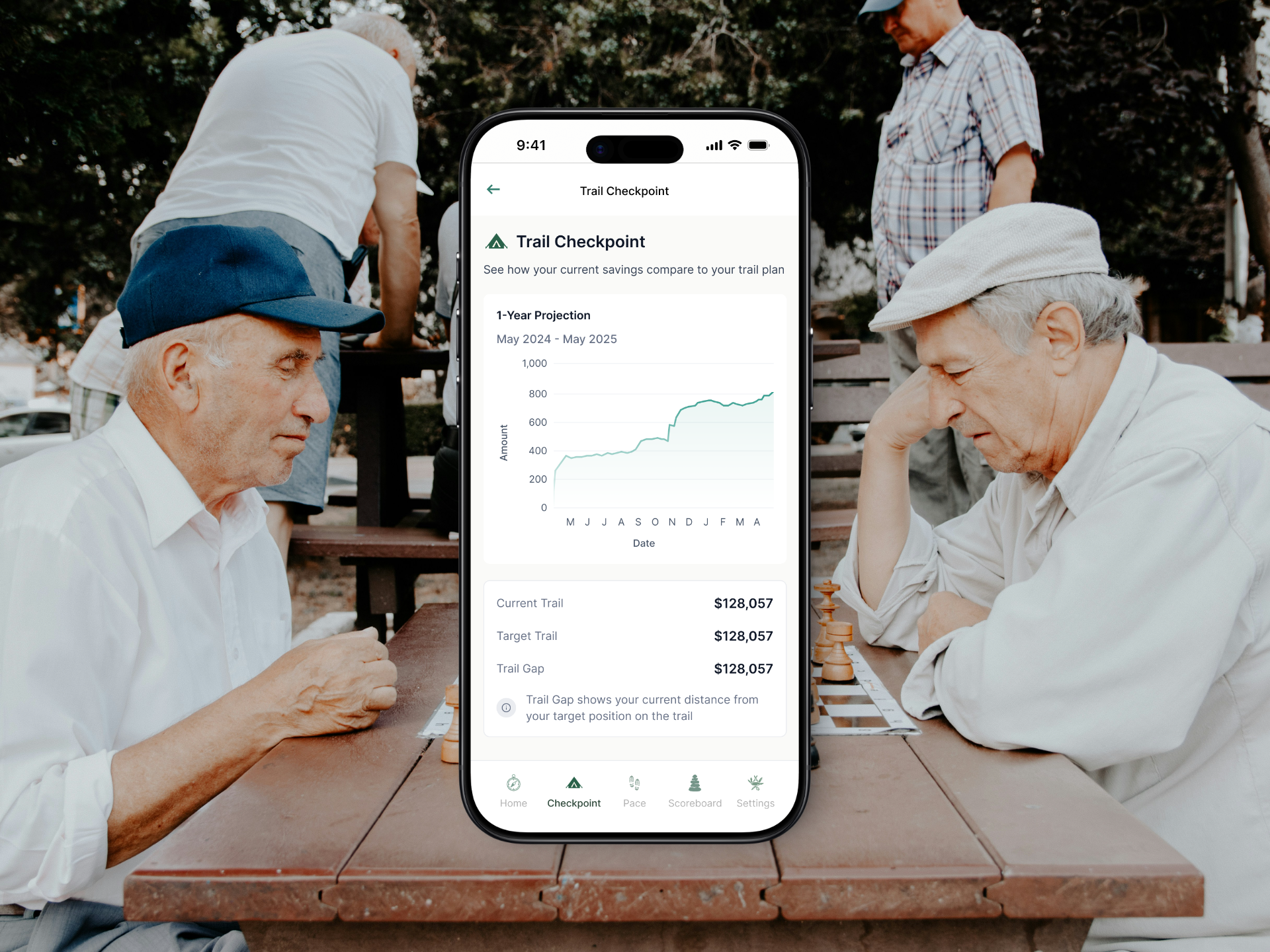
Translating complex financial concepts — projections, benchmarks, compound growth, volatility — into visuals that anyone could understand without financial expertise.
Keeping users engaged over months and years without requiring manual data entry or daily interaction.
Balancing information density with a calm, motivating interface that worked across a wide age range.
My Role
What I worked on
Retirement projection UI & UX
Data visualization & interactive charts
Design system development
Mobile app development in Bubble
Habit-building user flow design
Design Showcase
Interactive charts and retirement projection tools tailored for clarity.

The Solution
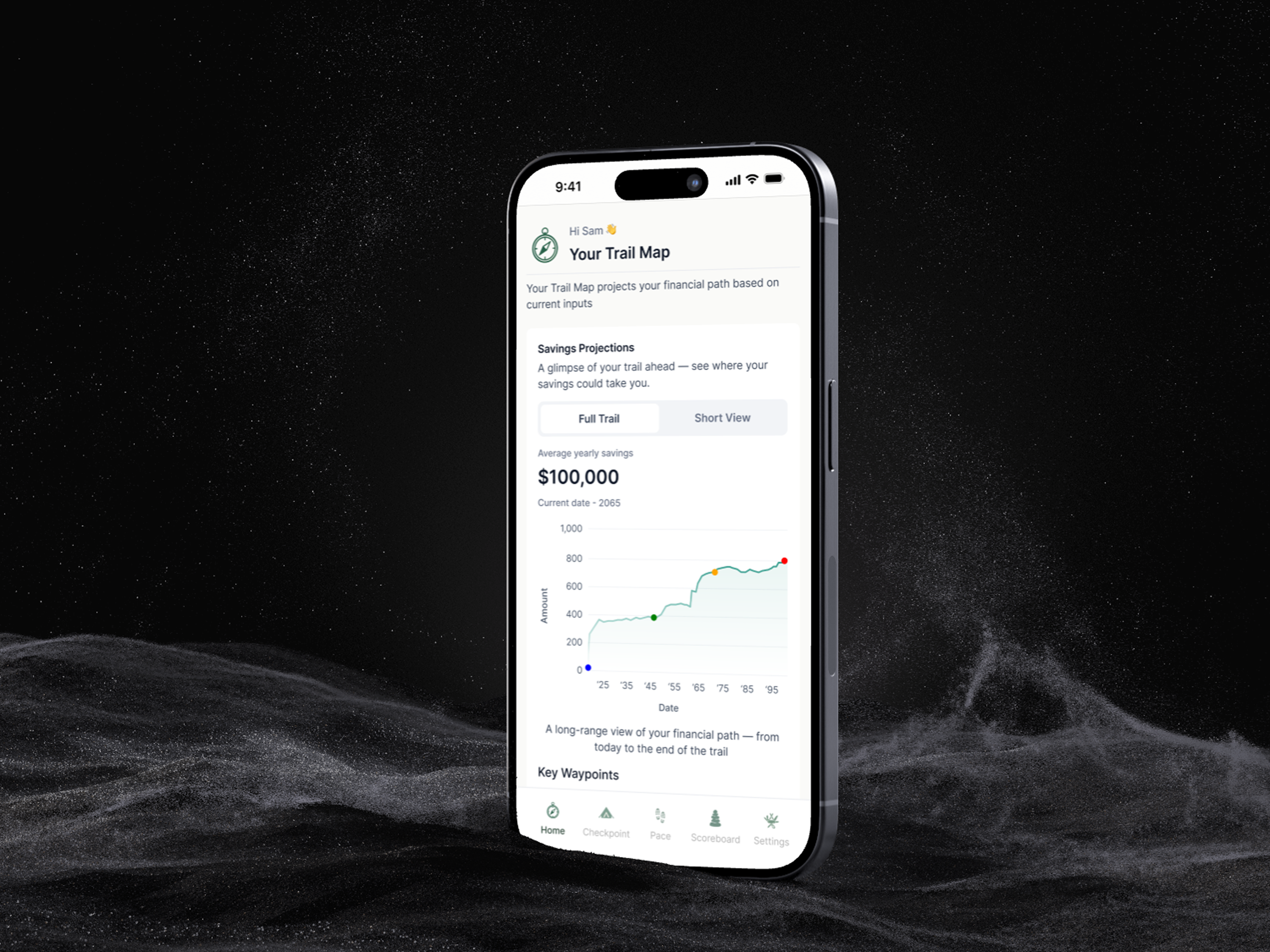
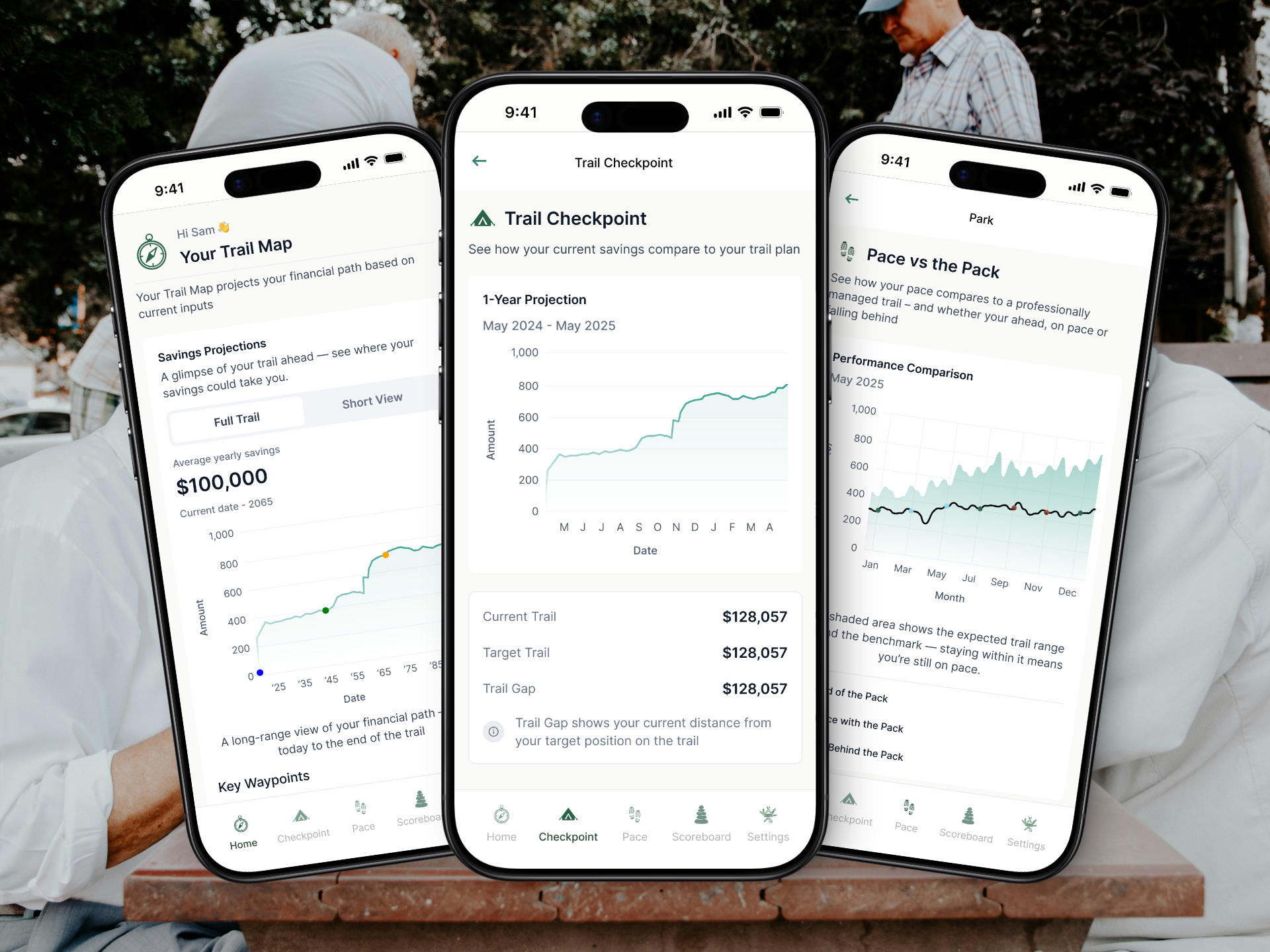
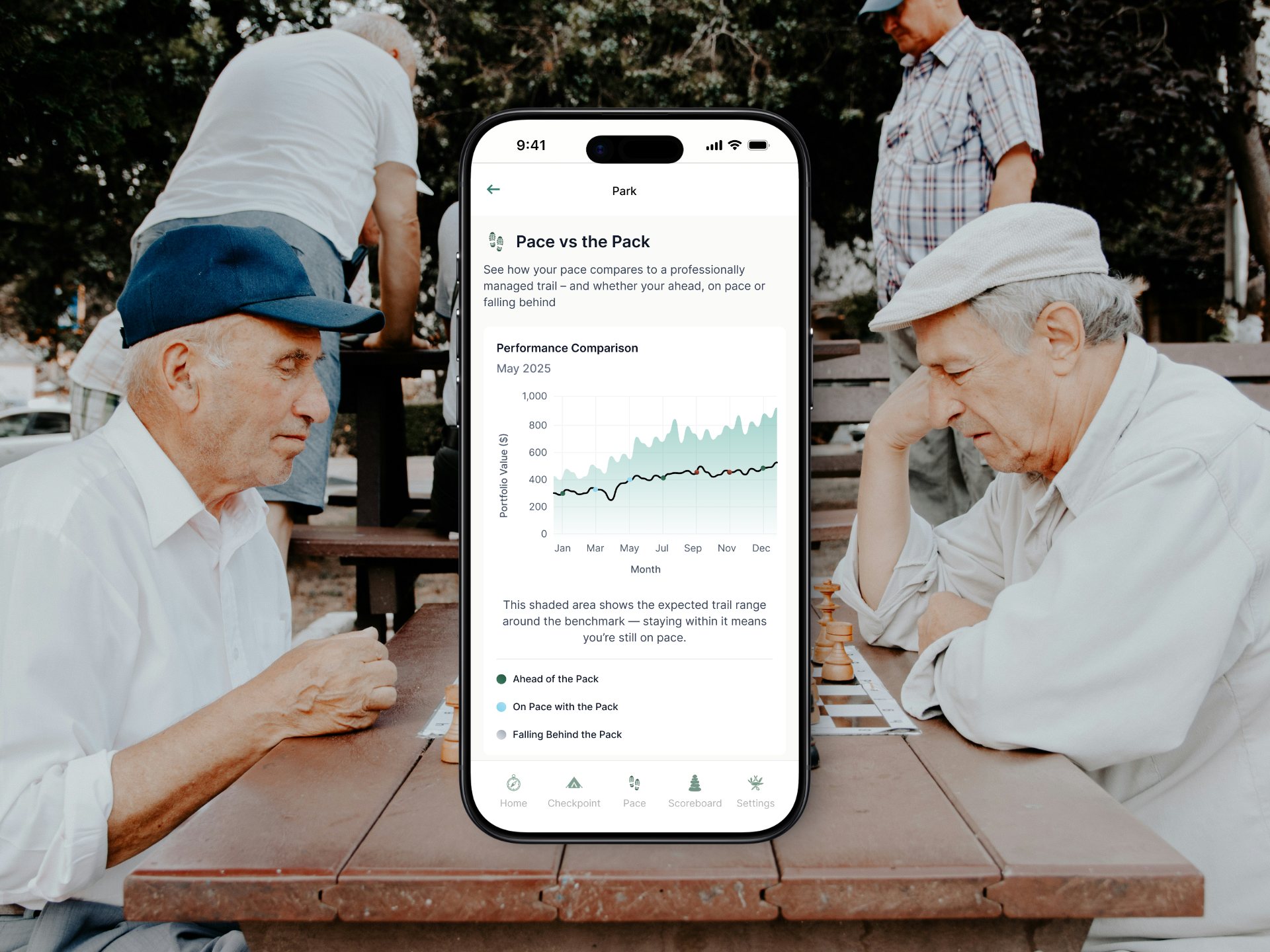
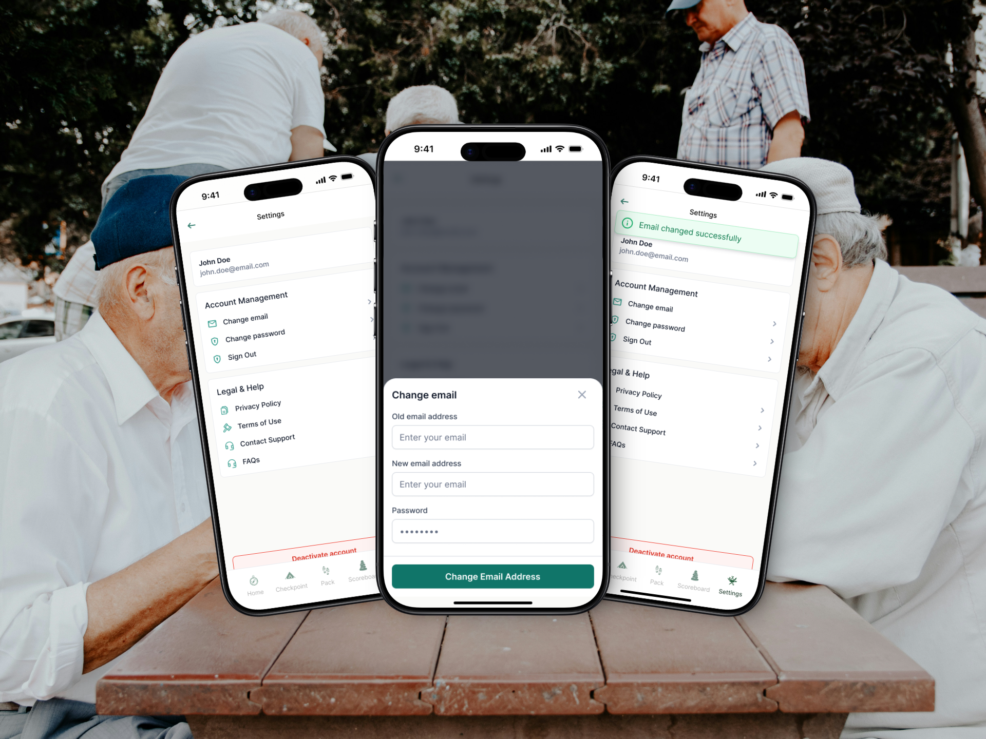
I designed the experience around a one-time Trail Setup flow that collects key financial inputs and powers the entire product from that point forward — no recurring data entry required. The dashboard uses a modular system of visual components: progress scores, projection charts, and peer benchmarks that tell a story rather than just display numbers. The key design decision was treating retirement savings as a journey, not a spreadsheet. Progress scoring and "Pace vs Pack" benchmarks gave users a sense of where they stood relative to their goals and peers, creating the kind of motivational feedback loop that keeps people coming back. A scalable design system was built to support charts, scoring states, and future premium features. The entire app was designed and built in Bubble within 2 weeks.
The Outcome
TrailHead turned abstract pension numbers into a visual journey that people actually wanted to check. Users gained immediate clarity on their savings trajectory without needing financial expertise, and the scoring and benchmark systems created ongoing motivation to stay on track. The one-time setup approach removed the biggest barrier to sustained engagement — the friction of manual data entry — making long-term financial planning feel as simple as checking a weather app.
"Tife did a perfect job and I am willing to hire him again when the opportunity comes."
Like what you see?
Let's talk about building something like this for your business.